


Interpretable Machine Learning / Explainable Artificial Intelligence
This post was created in preparation for my talk at PyConDE 2019.
The slides for the talk are available on GitHub.
Introduction
Automatization is a good thing in general. It finishes easy, repetitive tasks, and enables humans to use their time and brain power for newer, more challenging problems. And since machine learning (ML) models automatize decisions, they are a good thing in general, as well.
However, there are a few problems with these models, especially the more complex ones (also called black-box models).
Black-Box Models have Problems
A black-box model, informally, is a model that cannot be understood by looking at its parameters. A linear model is not a black box, but a neural network is - unless you’re like Cypher looking at Matrix code.

Three stories shall illustrate the common problems with black-box models.
1. Fairness
In October 2018 world headlines reported about Amazon AI recruiting tool that favored men. Amazon’s model was trained on biased data that were skewed towards male candidates. It has built rules that penalized resumes that included the word “women’s”. (Source blog post)
2. Understanding
More and more scientific disciplines (like biology) use ML models for producing scientific outcomes. In these cases, we want to use data to extract scientific knowledge. We don’t care too much about a 98% accurate Random Forest if we can’t extract an explanation from the model (Roscher et al., 2019)
3. Explainability and Debugging
The EU’s GDPR states: “[the data subject should have] the right … to obtain an explanation of the decision reached”.
One of the consequences of this law is that in February 2019, the Polish government added an amendment to a banking law that says that a bank needs to be able to explain why a loan wasn’t granted if the decision process was automatic.
A similar problem is that an inaccurate model must be debugged, e.g. to find out why some data was misclassified. If you know why and where your model fails, you’re better equipped for feature engineering, or can better decide to replace a model with a different one.
One good example is from Ribeiro et al. 2016, a classification problem of “Husky or Wolf?”, where some Huskys were misclassified. If you look at the pixels that influenced the decision the most, you find that the model has learned to use the snow in the background as a strong indicator for “Wolf”:
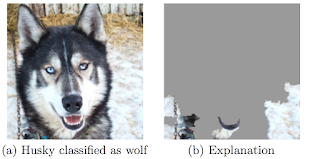
In this case, you’d have learned that one possible way forward would be to collect more training examples from Huskys in winter.
Interpretable Machine Learning (IML) to the rescue!
“Interpretability is the degree to which a human can understand the cause of a decision”
– Miller, Tim. “Explanation in artificial intelligence: Insights from the social sciences.” arXiv:1706.07269
The lesson in these three stories is that the recent rise of powerful but complex black-box models introduces the need to be able to look under the hood of machine learning models and understand their behavior.
Optimizing a loss function is easy to operationalize, and that’s one reason why we frame a ML problem in terms of a loss that we want to minimize. But in reality, we often care about more criteria than just accuracy (Doshi-Velez et al., 2017): We want our model to be fair and explainable - this would also increase social acceptance of our model, and of AI in general. We also care a lot about safety. In autonomous driving, we want to be 100% certain that the abstraction for “cyclist” a neural network has learned is correct. Imagine a model would need to “see” two wheels to recognize a bicycle; then, a bicycle with bags over its back wheel would get run over by a car.
The field of Interpretable Machine Learning (IML) is set out to solve these problems. It’s a relatively new field, and as such, it changes quickly, new methods emerge at high speed, and the terminology is not yet consistent. You might hear it as Explainable AI (XAI), for example. Some people (like me) use these terms as synonyms, others make a distinction between them. The lingo is just not consistent yet.
This article is heavily based on Christoph Molnar’s book Interpretable Machine Learning, which is available for free online.
How to Achieve Interpretability
If you want to understand and explain the behavior of your model, there are two ways to go:
Option 1: Use interpretable models
The first option is to use simple models that are already interpretable.
One option is a linear regression model. It’s always a nice first choice to run, if just as a benchmark. The regression coefficients and their p-values are a nice measure for the size and importance of each feature.
Another candidate, especially for classification, is a short decision tree. They can be visualized in an intuitive way, and most people can use it to make predictions themselves, too.
However, these models have disadvantages. Most importantly, both usually suffer from poor performance in the real world. Linear models are constrained to linear relationships, so they tend to fail whenever the real world contains nonlinear effects (think, for example, of the relationship between your age and your body height). Decision trees, on the other hand, are designed to model step functions, so they fail when the real relationship is in fact linear.
These models were popular in the 1980s, where you had small datasets (e.g. in medicine) and cared about simplicity and interpretability. Linear models and decision trees are simple because they come with a set of very restrictive assumptions, which are just not true in the real world. So there has to be a better way to achive interpretability - and luckily, there is.
Option 2: Use black-box models and post-hoc interpretation methods
A better option is to just go ahead and use your fancy black-box model. Build your neural network, and add a few more layers so marketing can sell it as our Deep Learning AI™.
You can start dealing with understanding and explaining your model afterwards, once your model is trained. That’s why these methods are called post-hoc methods: you apply them after your model is trained.
Interpretation Methods
In this article, I’ll introduce three methods for IML. Each method is solving the problems introduced in one of the three stories at the beginning. As always, the answer to “which method” is “it depends”. What do you want to understand? The global behavior of your entire model or the factors that influenced a certain prediction? Do you only want to understand the importance of each feature, or also the amount of its contribution? Are there any constraints from the legal department (must all features be explained? is the main target to avoid minority bias?)?
These methods are all model-agnostic. This means they are not tied to a certain model type, such as Random Forests. You can decouple the model and the interpretation. Model-agnostic methods have a few nice advantages (Ribeiro et al., 2016):
- You can completely swap out the model if a different algorithm fits the problem better, and your interpretation methods can just stay in place.
- You can use multiple different interpretability methods. The ML engineers in your department might care most about feature importance, while the legal/compliance department cares most about feature effects. And your customers only care about what factors were the most influential for their personal prediction.
- You can even use different features for training and interpreting your model: Train your document classifier with word2vec or any other non-interpretable vector embedding, but interpret it using the actual words again, for example with a simple rule-base algorithm: “If the document contains ‘rocket’ and ‘moon’, classify it as aerospace”.
The basic idea of all interpretation methods is that you manipulate your input data and measure the changes in the predicted output. For example, take the person whose loan application just got denied, then wiggle on their salary - make it $10,000 larger or smaller - and see what happens to the model’s decision.
Data and Models used
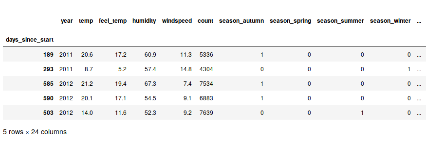
To illustrate the three methods, I will use the bike sharing dataset from the UCI Machine Learning Repository. It’s a widely used sample data set, where you use features like a day’s weekday, temperature, humidity, in order to predict how many bikes will be rented on that day.
Here are a few sample rows of the data set. I have preprocessed it slightly and aggregated the numbers from hourly to daily data:

The target column, count, is the number of bikes rented on that day. For the model training, we’ll transform the categorical features into dummy variables:
As the model, we’ll train a simple, untuned Random Forest. Since the methods are model-agnostic, the choice doesn’t matter for the sake of this article - we could just as easily use any other algorithm.
The Random Forest has a mean absolute error of around 172. That means that on average, the predicted number of bikes rented is 172 away from the true number.
Let’s dive in and look at the following three methods that allow us to understand our black-box model!
- The permutation feature importance (PFI) is a global method that explains the importance of each feature.
- Partial dependence plots (PDPs) are a global method that explains the effect of each feature.
- Shapley values are a local method that explains the effect of each feature, but for a single prediction.
Permutation Feature Importance
In a linear model, the importance of a single feature can be measured by the standardized regression coefficient (or the associated p-value). The permutation feature importance (PFI) is a generalized, model-agnostic version of this value.
The PFI was first described in Leo Breiman’s paper on Random Forests, but it can be used for any other model as well.
The basic algorithm to compute the PFI for one feature (i.e. one column) is this:
- Shuffle the column of interest
- Predict the outcome with true data
- Predict the outcome again with shuffled data
- Take the difference between the two losses
- Compute their pointwise average
Note that no retraining of the model is necessary. This saves a lot of time compared to other methods (like e.g. Shapley Values)
The PFI for one feature automatically captures interaction effects too, because permuting a column also destroys any interaction effects with other features that might have existed.
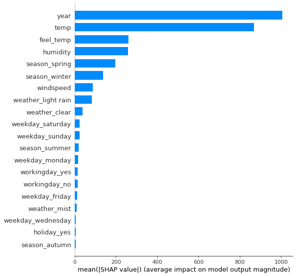
Let’s look at the feature importances of our Random Forest and find out which features are the most important. Python has a package called eli5 that provides a function for computing the PFIs:
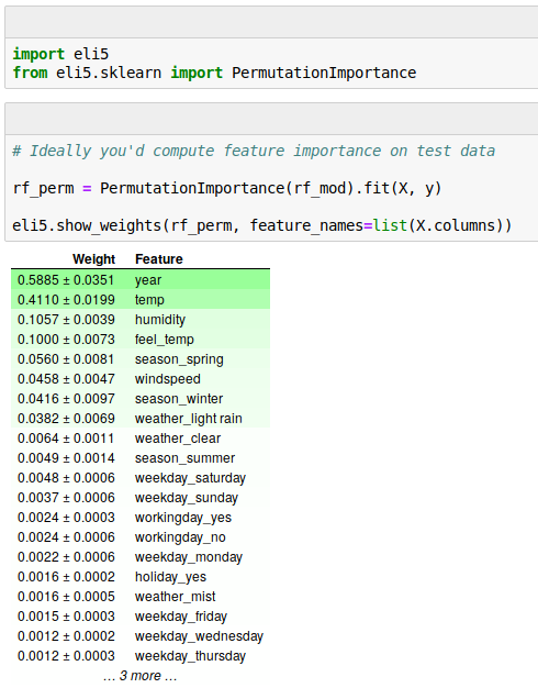
Here, we see that the most important feature is the year of the date (in the data used here, only the year-part of the date was recorded). This makes sense because the service was growing rapidly at the time the data was collected, and you’d expect much more service usage in each new year.
The second most important feature is the temperature on that day, and the third most important feature the humidity. This too is in line with what we would expect: More bikes on warmer days, but less bikes again once it gets too hot (a nonlinear relationship again!). Also, more humidity is probably bad for sales - but we’ll get to that in the next section on Partial Dependence Plots.
By looking at the PFI of each feature, we have a solution for the first of the three problems mentioned in the beginning of this article, the fairness of an algorithm. Now, we see how much each feature contributes to the predictions, and by this, we can make sure that features such as a person’s gender have no big influence on the prediction.
Partial Dependence Plots
In a linear model, the effect of a single feature can be measured by the feature’s regression coefficient. The partial dependence plot (PDP) is a generalized, model-agnostic version of this value.
PDPs were first described in Friedman’s paper on Gradient Boosting Machines. It’s most intuitive to first understand how a PDP is made for a categorical feature. Let’s use the season in our bike rental data set.
- For each feature value (spring, summer, autumn, or winter):
- Force the entire dataset’s
seasonto this feature value (e.g. winter) - Keep all other features (temperature, humidity, etc.) the same
- Predict the number of bikes rented
- Average the predictions
The PDP for the season then looks like this:
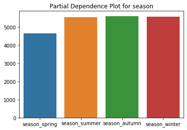
We see that we expect to rent out fewer bikes in spring, with all other seasons being roughly equal.
Understand the difference between the PDP of the season feature and the mean rented bikes grouped by season: In the PDP, we use every instance of the data for computing the “winter” effect. We even use data points from summer, where we had a temperature of 30°C, and replace the season feature with winter. In this case (generally: when features are correlated), the algorithm will generate implausible data points.
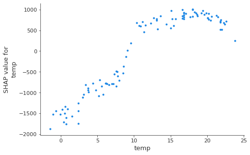
For continuous features, the PDP is constructed in a similar way - let’s use the daily temperature for this example: You generate a grid of feature values, say one grid point per degree Celsius. We’ll start with -10°C. Then you set the temperature of the entire data to -10°C, predict the number of bikes rented, and plot this point. At the end, we connect all points by a line.
Let’s look at the PDPs for the daily temperature and the humidity:
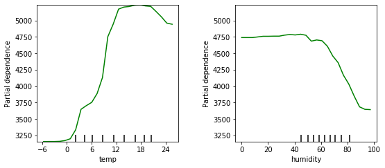
We see here that we can expect to rent out more bikes in warmer weather, but when it gets too hot, people won’t rent bikes as much. The ideal temperature seems to be in the 12 to 21 degree range.
The effect of the humidity is negative for higher values (above 60% humidity), but below that its actual value doesn’t matter that much.
You can also plot a two-dimensional PDP for two features together. This visualizes the interaction between two variables. Let’s look at the PDP for temperature and humidity together:
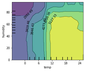
We see here that the “ideal” weather is between 12 and 21 degrees and less than 70% humidity.
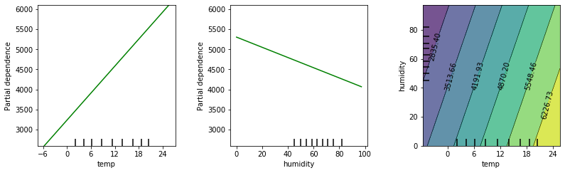
By the way, you could compute PDPs for a linear model as well. And if you do the math in your head, you’ll find out that in these cases, the plots will always be linear. Here are the three PDPs if we had used a linear model instead:
If you recall the second story in our introduction above, you’ll find that PDPs are one possible solution this problem. They visualize each feature’s effect on the model’s prediction, and thus give us knowledge about the model’s behavior, and ideally also about the situation in the real world.
Shapley Values / SHAP
Shapley values, and in particular the new derivative method SHAP, is a very promising method. You can use Shapley values to describe each feature’s importance for one particular prediction, and by aggregating over data instances, you can get other interesting measures such as global feature importances. SHAP could very well be the one-size-fits-most method in IML.
Intuitively, the question that Shapley values answer is: “How to fairly distribute the prediction among the features?” How much does each feature contribute? For example, when interpreting a predicted apartment sale price of 320’000€. Its features included a size of 64 sq.m., the 5th floor, the apartment does not allow pets, and it has a balcony. Now, how did each feature influence the prediction? For example, the average prediction over all training data was 300’000€. Then one possible Shapley-based interpretation might be: The above-average size of 64 sq.m. contributed an additional 15’000€ to the predicted price, the balcony contributed 7’000€, and the no-cats-allowed policy contributed -2’000€, i.e. it reduced the predicted price by 2’000€.
For linear models, each feature’s contribution is easily determined: $\beta_j \cdot x_j$. Shapley values can be seen as a generalization of this contribution.
Shapley values have an exciting theoretical fundament in game theory. Predicting is a game, where players collaborate and distribute a certain gain amongst them:
- The game is the prediction task for one single instance
- The gain is the difference between the actual prediction and the global average prediction.
- The players are the feature values that collaborate to receive the gain (= predict a certain value)
- Features act as a coalition
Each feature’s Shapley value now assigns a payout to each feature, depending on their contribution to the total gain.
The computation is a bit complex and I’ll skip it here - if you’re interested in the technical details, I can refer you to the original paper or the SHAP chapter in Christoph Molnar’s book.
Visualizing Shapley Values
The Python package shap implements a very pretty way of visualizing Shapley values: You plot them as forces that push the prediction away from the base value (i.e. the average prediction over the entire data set). Since Shapley values are additive importance measures, you can weigh positive and negative values up against each other, to see which ones cancel out, and which ones push the prediction the farthest away from the base value.
Imagine you work at the bike rental company, and your boss storms in to ask why we only rented out so few bikes yesterday. “It was a perfect 15.4°C, why didn’t they use our bikes?”

You’d show him this image and can argue: “Yes, the temperature was nice, but that effect was compensated again by the high humidity of 91.7%. And then, the “light rain” pushed the numbers down even further”.
In this example, the calendar year of 2011 also had a strong negative effect (because the bike service grew a lot from 2011 to 2012, they rented out fewer bikes in 2011 and more in 2012).
Shapley-based feature importance
One very nice property of Shapley values is that you can aggregate them and plot them in different ways, so additionally to the local explanations we plotted above, you can aggregate them to a global explanation for your entire model.
A measure for feature importance is easily computed: We average the absolute Shapley values for each feature. The resulting plots then look very much like the permutation feature importance discussed earlier, and they can be used as an alternative.
But: There is a big difference between these importance measures: Permutation feature importance is based on the decrease in model performance, while SHAP is based on the magnitude of feature attributions. As always, the best method for you depends on what is most fitting or interesting for you to measure and plot.
SHAP dependence plot
The SHAP dependence plot is a simple visualization of Shapley values, and give you a quick global overview over the effects of one feature. They are very easily plotted:
- Pick a feature.
- For each data instance, plot a point with the feature value on the x-axis and the corresponding Shapley value on the y-axis.
These plots are an alternative to Partial Dependence Plots discussed earlier. However, while PDPs show average effects, the SHAP dependence also shows the variance on the y-axis. Especially in case of interactions, the SHAP dependence plot will be much more dispersed in the y-axis.
Shapley Values: Conclusion
Remember the third story in the introduction: A person applied for a loan and got declined. If he demands an explanation on why he was declined, you can now compute and show the Shapley values for his particular prediction. Maybe they’ll show that his income was okay, but due to a defaulted loan 15 years ago, his credit score was pushed very far down.
Other Methods not covered here
Christoph Molnars book introduces many other methods that I have left out in this post. The chapter I found most interesting was the one about Adversarial Examples.
Just like you can phrase a definition of something by stating what it is not, you can interpret a ML model by examining where it fails. For example, you have an image classification model (dog, cat, mouse, …), and you want to find images that a human would (correctly) classify as “cat”, but the model is very sure it’s a dog.
There are algorithms to create such images, and they have a dark side: You can use them to attack a deployed ML model. For example, imagine you had a sticker that you can stick on your dog, and the model gets confused and classifies the dog as a toaster. Well, this sticker exists. And now imagine you stick this sticker on stop signs, and self-driving cars don’t recognize them anymore. This poses dangers to models deployed in the real world, and there might be an eternal arms race between attackers and defenders coming up - much like it has always been in “traditional” cybersecurity.
The Future of Interpretable Machine Learning
Under the premise that (a) machine learning automatizes decision making and (b) we like to automatize everything we can so that we can focus on new, more challenging problems, I predict that over the next years we will encounter many more ML models in the wild.
Interpretable Machine Learning will play a crucial part in this development for a number of reasons:
- The hesitant and distrustful will require much more transparency and explainability of a model’s behavior in order to adopt ML technology in their business.
- We are never able to perfectly specify what we want to our computer. He’ll just stupidly do what we tell him to do. Think of a genie in a bottle that takes your wishes literally: “I want to be happy for the rest of my life!”, and the genie gives you a hit of heroin, then kills you. As is often the case when a government introduces new legal constraints, those affected by the constraints might find an unexpected solution the lawmakers didn’t intend. Similar things can happen with ML models, and interpretability methods help us in discovering and resolving these situations.
- A deployed black-box model can be vulnerable to adversarial examples: If an attacker knows how to fool a model, he can influence the decision to his liking. Those who want to defend against these attacks will have to look at interpretability methods to do so.
As has happened with machine learning itself, interpretable machine learning methods will most likely be automatized in the future. Like a test suite that runs after every change in a code repository, every retrained model gets an automatic report of things like feature importance, feature effects, etc.
But I don’t see a need to be alarmed: Data scientists won’t die out anytime soon. A similar thing has happened in web development: Today, anyone can build a website without knowing HTML, CSS, or JavaScript, yet we still need frontend developers. And analogously, tomorrow, anyone will be able to train a machine learning model, yet we will still need machine learning experts.